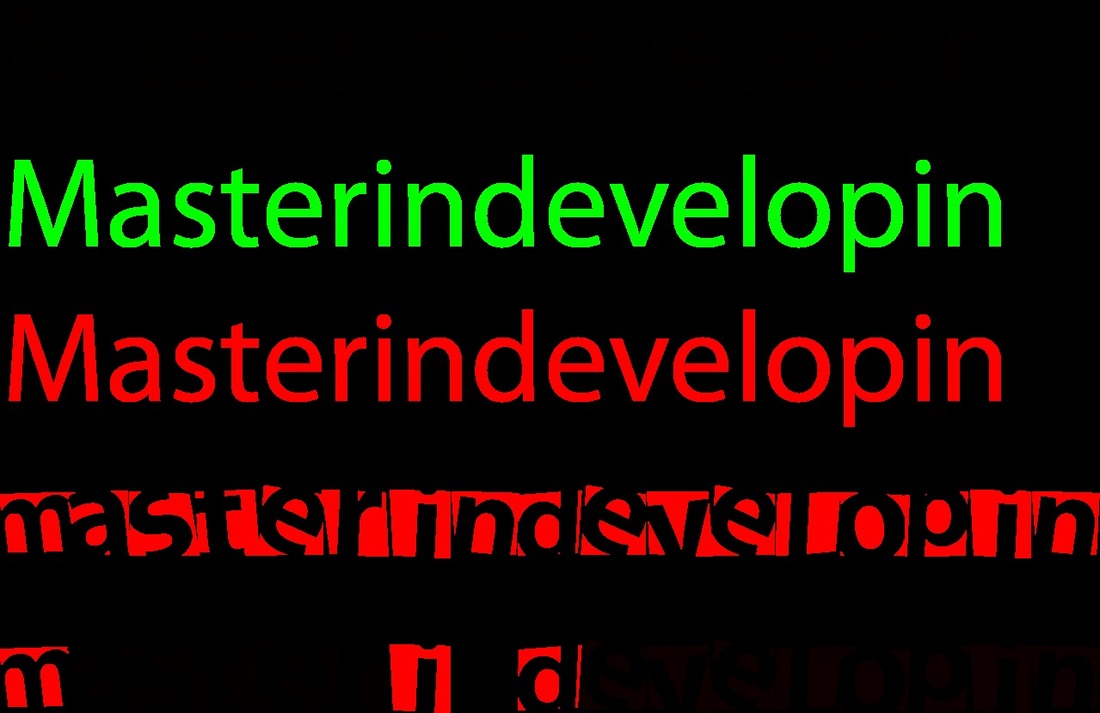
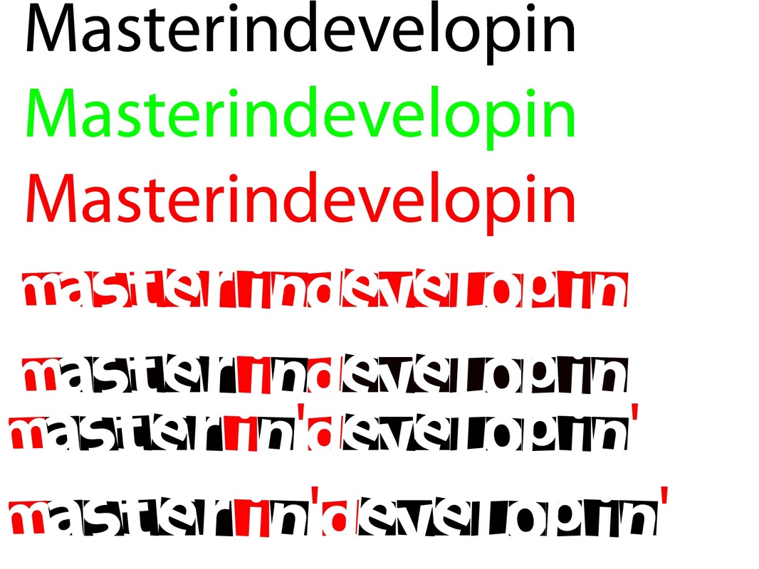
Colour ConsiderationsDuring my preproduction Work I have made a logo for my site as seen above, but I experimented with colour, fonts, shapes and sizes before I managed to create the logo above. Here are the steps I first took using Adobe Photoshop to experiment and create a logo.
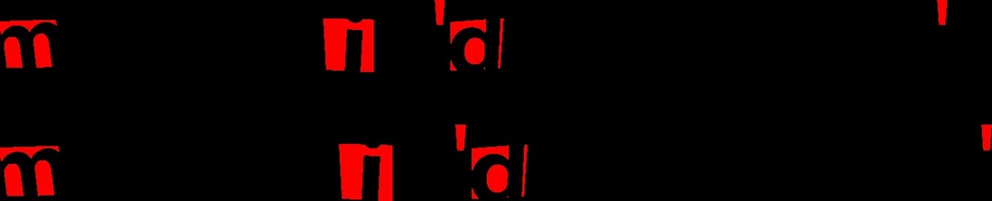
In the images shown I decided I wanted One dark colour and One bright colour in my logo, so I started to change the background and found two colours that l I liked which were Red and Black with a 3d shadow behind it. I started to change the font of the text and then the layout until I found a good combination. I also choose the title "Masterin'Developin' " as my site is about developing Anoterh reason I chose this title is because the title has two meanings which are "Mastering developing" and "Master in Developing" - To learn and the learned! On top of this I also chose this title with a letter block theme making it look like a toy cube from a toy box. This was used to show the site visitor how easy it is to get your head around the contents on my site, and that the steps provided are easy-to-follow. |
|
 |
|
